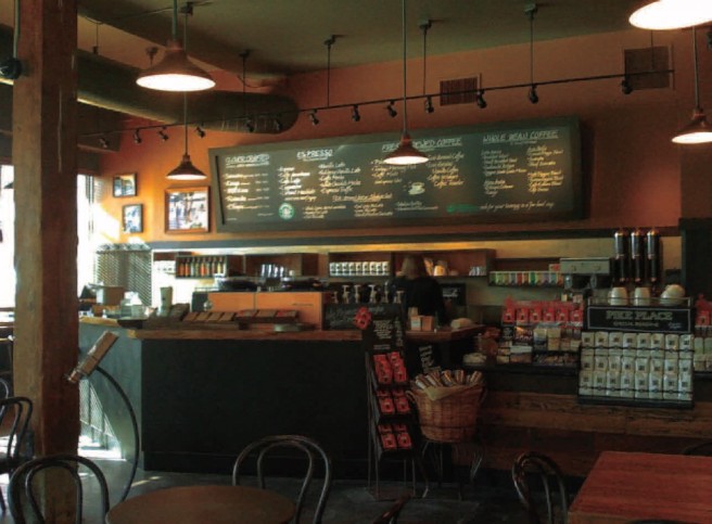
Commercial spaces have the widest variety of people coming through them. All of these people have physical, mental, and emotional needs. Although most of them may not realize it, color can play a huge part in whether or not they feel that these needs are being met. To further explore and observe the use of color in commercial spaces and the way it makes people feel, I visited some commercial locations. Starbucks surprised me the most!
This is a place I, like most Americans, am familiar with. I went through the drive through every day in January to get my free coffee and I spent many hours there during the months that I didn’t have any other way to access the internet. It’s safe to say I know this brand. If you had asked me what colors are used in the space before I visited for this purpose, I would’ve answered correctly, but I was surprised at how little color they actually use. The color palette is full of dark neutrals. There is a lot of brown, a lot of wood, and some grey. The only true color is a rich burgundy that spans across the back wall in the baristas’ work space.
When I walk into Starbucks, I feel calm, warm, and ready to drink coffee. It feels luxurious. I noticed that I am more likely to order a fancier drink if I walk inside, while if I go through the drive through my mind is on the cheapest, most effective option: drip. My theory is that this is the purpose of the use of colors. They designed it to make you want to drink coffee… expensive, delicious coffee. How convenient! These people know exactly what they are doing. They are trying to appeal to the younger crowd that has grown up with the acceptance of four dollar cups of coffee, like me, but also to my father’s generation, people that have been working hard for years and have found an escape in the warm community that Starbucks seems to foster. My father loves Starbucks like no one else I know. He goes there every single day. The baristas know him, his friends, and they know all about me. So what is it that Starbucks does to make the place feel like a sort of home to both a young person and someone who is nearing sixty years of age? A big factor is the lighting. To me it feels dark, safe, and comfortable. I was surprised to see that it is actually a fully lit space. In addition to floor to ceiling windows on two of the four walls, there are lights everywhere. They are stylish, non-fluorescent lights, but bright lights nonetheless. I never would have noticed this if I hadn’t visited for this purpose. The use of so many rich colors tones the lights down so well that I didn’t even notice they were there. Well done, Starbucks.
For me and my dad, and for many other Americans, Starbucks makes us feel happy and comfortable. This makes sense, as the colors used are widely accepted as being associated with warmth and happiness. Not only does this contemporary space meet our physical needs, but our emotional ones as well.
